shutter: 1/50
aperture: f/4.5
ISO speed: 100
camera: Sony SLT-A33
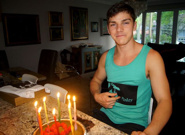
"chyea das me"
shutter: 1/30
shutter: 1/30
aperture: f/3.5
ISO speed: 500
camera: Sony SLT-A33
So "this guy" I know had a big birthday coming up, and I knew I had to make him an awesome gift that would make it memorable. He's a music producer, and is working on a new album, which is going to be a solid one. Comparing the songs on his soon to be released album compared to his last, gave me a sense of sophistication and progression. Sure I give him my opinion on the songs' progression, but I felt the need to contribute more to the completion of the album. I've always wanted make my own graphic for a t-shirt, but not with iron on paper that just ends up fading away with a few washes. For our alternative process unit in photography class, silkscreening was a optional process provided. Combining a project and a present is always fun as it gives you extra motivation to make the project better, and vice versa. I took many pictures of him, with bold poses not showing too much of his face, as I wanted his figure to be on his own shirt, although not obvious to the world. As I was shooting the pictures and different poses of him, I took a picture of him fixing his hair by accident. Scanning the pictures on my computer after the shoot, left me contemplating between a serious, bold pose, and the natural hair-fixing photo. I ended up choosing the unplanned shot, opposing to the fact that most people would have probably chosen the other shot for this scenario. The title of his new album is "Who We Are", which was the message I really felt was portrayed in the picture I chose. He has a natural, light lauging-smile on his face, with one hand on his forehead, looking as if he just made a silly mistake and is now laughing it off, displaying that we are "who we are". Although the picture may sound as if it looked youthful, it really looked mellow and complete. I cropped his body out of the picture, made it b/w, and put it on a black background in photoshop with his name and new album at the opposite side of the picture. Finding the perfect font for his name and new album title required a lot of scavenging. Once I finally found the font I was was so pleased, as it was so clean and crisp, reflecting another style/side of the picture so well. After a choatic few days of pulling this together, I felt a huge wave of relief as my first tranfer to a t-shirt was incredibly successful. I loved the shirts, and my final curiosity was to see his reaction when opening his present on his birthday.
So "this guy" I know had a big birthday coming up, and I knew I had to make him an awesome gift that would make it memorable. He's a music producer, and is working on a new album, which is going to be a solid one. Comparing the songs on his soon to be released album compared to his last, gave me a sense of sophistication and progression. Sure I give him my opinion on the songs' progression, but I felt the need to contribute more to the completion of the album. I've always wanted make my own graphic for a t-shirt, but not with iron on paper that just ends up fading away with a few washes. For our alternative process unit in photography class, silkscreening was a optional process provided. Combining a project and a present is always fun as it gives you extra motivation to make the project better, and vice versa. I took many pictures of him, with bold poses not showing too much of his face, as I wanted his figure to be on his own shirt, although not obvious to the world. As I was shooting the pictures and different poses of him, I took a picture of him fixing his hair by accident. Scanning the pictures on my computer after the shoot, left me contemplating between a serious, bold pose, and the natural hair-fixing photo. I ended up choosing the unplanned shot, opposing to the fact that most people would have probably chosen the other shot for this scenario. The title of his new album is "Who We Are", which was the message I really felt was portrayed in the picture I chose. He has a natural, light lauging-smile on his face, with one hand on his forehead, looking as if he just made a silly mistake and is now laughing it off, displaying that we are "who we are". Although the picture may sound as if it looked youthful, it really looked mellow and complete. I cropped his body out of the picture, made it b/w, and put it on a black background in photoshop with his name and new album at the opposite side of the picture. Finding the perfect font for his name and new album title required a lot of scavenging. Once I finally found the font I was was so pleased, as it was so clean and crisp, reflecting another style/side of the picture so well. After a choatic few days of pulling this together, I felt a huge wave of relief as my first tranfer to a t-shirt was incredibly successful. I loved the shirts, and my final curiosity was to see his reaction when opening his present on his birthday.


No comments:
Post a Comment